What different colours mean?
You need to pick your colours carefully to enhance specific elements of the logo and bring nuance to your message with the use of shade and tone. Every colour, including black and white, has implications for logo design.
In general terms, bright and bold colours are attention-grabbing but can appear brash. Muted tones convey a more sophisticated image, but run the risk of being overlooked. More specifically, particular meanings are ascribed to different colours in society…
- Red implies passion, energy, danger or aggression; warmth and heat. It has also been found to stimulate appetite, which explains why it is used in so many restaurants and food product logos. Choosing red for your logo can make it feel more dynamic.
- Orange is often seen as the colour of innovation and modern thinking. It also carries connotations of youth, fun, affordability and approachability.
- Yellow requires caution as it has some negative connotations including its signifying of cowardice and its use in warning signs. However it is sunny, warm and friendly and is another colour that is believed to stimulate appetite.
- Green is commonly used when a company wishes to emphasise their natural and ethical credentials, especially with such products as organic and vegetarian foods. Other meanings ascribed to it include growth and freshness, and it’s popular with financial products too.
- Blueis one of the most widely used colours in corporate logos. It implies professionalism, serious mindedness, integrity, sincerity and calm. Blue is also associated with authority and success, and for this reason is popular with both financial institutions and government bodies.
- Purple speaks to us of royalty and luxury. It has long been associated with the church, implying wisdom and dignity, and throughout history it has been the colour of wealth and riches.
- Black is a colour with a split personality. On the one hand it implies power and ophistication, but on the other hand it is associated with villainy and death. Most logos will need a black and white version for use in media in which colour is not available – and there is currently a trend for bold monochrome logos and word marks.
- White is generally associated with purity, cleanliness, simplicity and naiveté. In practical terms, a white logo will always need to stand in a coloured field to make it show up on a white background. Many companies will choose to have a coloured version and a white version of their logos; for example, the Coca-Cola word mark appears in white on its red tins and brown bottles but is used in red when needed on a white background.
- Brown has masculine connotations and is often used for products associated with rural life and the outdoors.
- Pink can be fun and flirty, but its feminine associations means it is often avoided for products not specifically targeted at women.
These associations are not rigid rules, of course, but they’re worth keeping in mind as you make your colour choices. Remember that the overall impact of your logo design will depend not on the colours themselves but upon how these interact with the shapes and text.
Single or multiple colours: Multiple colours are difficult to pull off, but can work. To get the maximum impact of your chosen colour’s coded message, I normally stick with a single colour when creating a logo design although there are some very successful multi-coloured logos for example Google.
The implication of multiple colours is that these companies are offering a wide choice of products and services. The multiple colours used for the Olympic rings carry a message of diversity and inclusivity.
A newly emergent trend in logo design is the use of mosaic patterns. These naturally require several colours, ranging from contrasting brights to multiple shades of a single colour.
Think globally: If your client is a global corporation, choose your logo colour with care. There are cultural differences in the way colours are interpreted. For example, red is considered lucky in China, while white is the colour of death and mourning in India.
Finally, don’t put too much focus on colour choice. Consider that one in 12 of us suffer from colour blindness. Plus there’s always the likelihood that any logo you produce for a client will end up be reproduced in monochrome, or even in different colours, as they see fit. So make sure your colour choice reinforces and enhances the design of your logo but doesn’t define it.
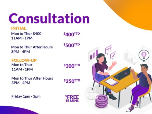
Be sure to join our Facebook, Instagram, Tiktok and our Website for more valuable information. Ask about our Business Startup Kit, Retainer Package, Year End Retainer Package , Business Bank Account or learn how manage your finance with our Prerecorded and Live Courses. Book a FREE 15 mins CONSULTATION on Fridays from 1pm to 3 pm.
“A wealthy person is simply someone who has learned how to make money when they’re not working.” – Robert Kiyosaki


